It’s no secret that the world’s energy supply needs to transition from carbon-emitting, nonrenewable sources like petroleum, natural gas, and coal to renewable, carbon-free sources like solar, wind, and geothermal. It is natural to wonder how much renewable energy is produced. Let’s take a deeper dive into one of these sources, solar energy, and it’s usage in one part of the world, the United States. We will use Tableau along with a nifty visualization technique to display the results.
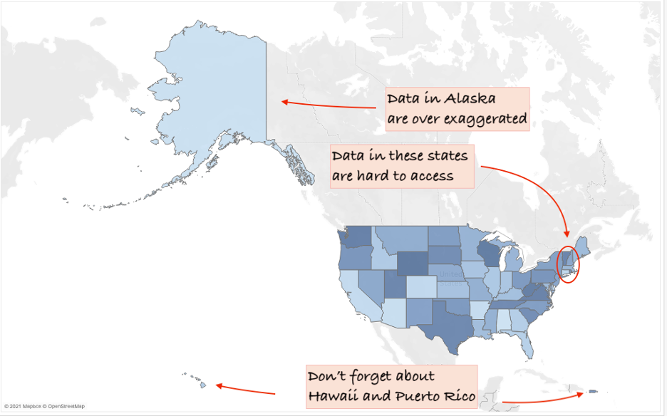
Unless emphasizing geographic features, Tableau’s built-in mapping features are suboptimal for displaying United States data. The two culprits? Hawaii and Alaska (Puerto Rico is a marginal third culprit). With Hawaii, Alaska, and Puerto Rico in view, the viz ensures that smaller states, especially in the northeast, are difficult to see and interact with. In other words, they are small and hard to hover over. The hex map is my favorite solution to this problem, and Tableau makes it easy to implement.
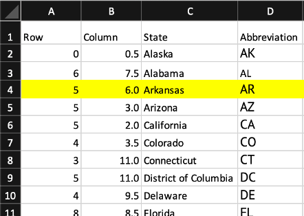
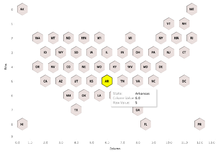
For a given hex map, there are two necessities: a mapping file, and the information that you are analyzing. For information, I’m using publicly available solar capacity data from the U.S. Energy Atlas. Regarding the mapping file, each state and Puerto Rico is assigned an x and a y coordinate corresponding to the “Row” and “Column” columns below, respectively. As in any scatter plot, each point (a state or Puerto Rico) is plotted according to it’s x and y value. When we assign a shape, perhaps a hexagon, to each point, we end up with a hexmap.
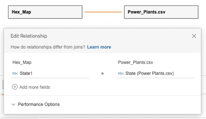
Now, all that’s left to do is to tie the mapping file to the solar capacity data file. In Tableau, establish a relationship between the two files in the data source screen using the state field in each file.
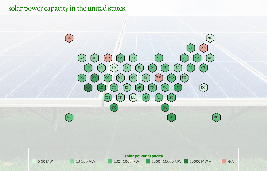
Now we can use the solar energy production data with our hex map to visualize the solar capacity for each state. California takes the top spot, with nearly 13 gigawatts of installed capacity. Right behind are North Carolina, Texas, and Florida. As was the purpose, data from all states and Puerto Rico are equally accessible.
To learn more about designing with Tableau, please connect with us at [email protected]
Jake Kohler is a Senior Consultant at Lovelytics, a data visualization and analytics firm. In his spare time, you can find Jake camping in the great outdoors, cooking up a new dish, or riding his bike through the city or over a mountain pass.


