
Context
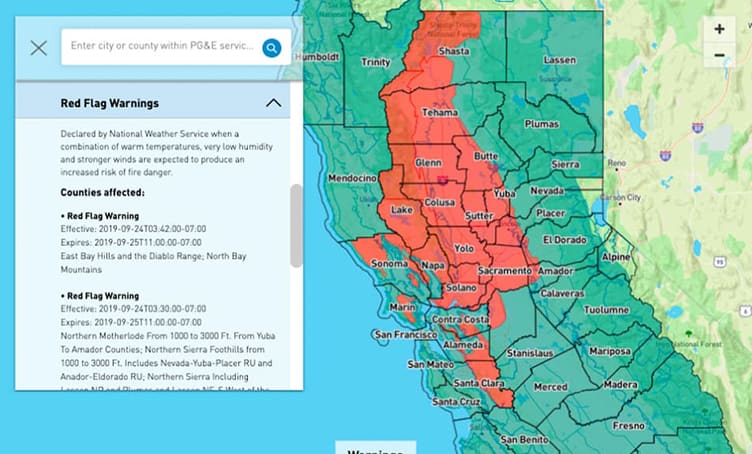
Pacific Gas and Electric Company (PG&E) keeps 16 million customers across 70,000 square miles of Northern and Central California up to date with a weather map that provides insights on wildfire risk and weather events that could impact their service. Lovelytics, Mapbox, & PG&E collaborated to create the interactive visualization showcased on PGE.com.
Outcome
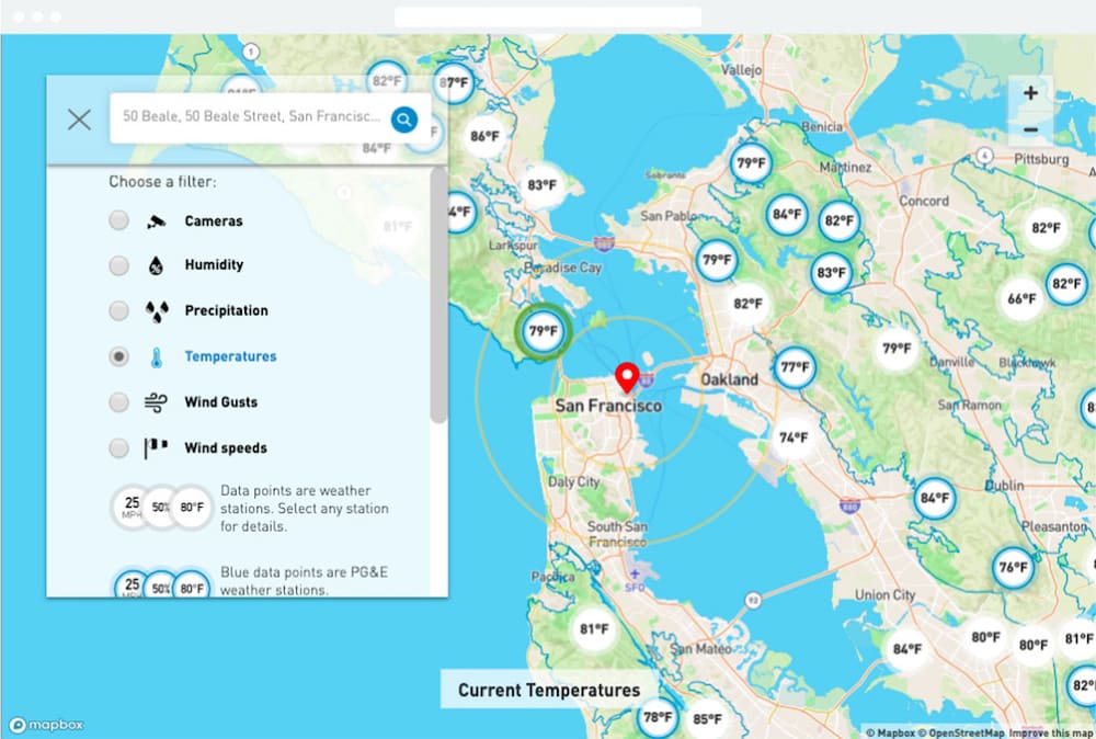
It’s a feast for weather geeks, and provides context for all: The map visualizes multiple layers of data including humidity, precipitation, temperatures, wind speeds, and wind gusts, and provides access to thousands of weather stations and dozens of high- definition cameras in use by PG&E. The map gives a heads up to regions whose seven-day forecast indicates a need to proactively turn off electric power lines and shows customers areas that are under a National Weather Service Red Flag Warning.