Has your organization recently deployed Tableau Mobile or is planning to deploy soon? Not sure how to optimize all your existing Tableau dashboards for mobile devices? Then keep reading for tips and tricks on making your desktop dashboards mobile-friendly!
You may be thinking, “Wait, I thought Tableau automatically created dashboards that would look great on a phone for me!”
Technically speaking, yes, Tableau does automatically create dashboard layouts optimized for mobile devices. In my experience, however, the automatically created layouts rarely get everything right and, often, you will need to take extra steps to ensure the best experience for your audience when they use a mobile device.
I recently created this sales dashboard using Tableau’s superstore dataset
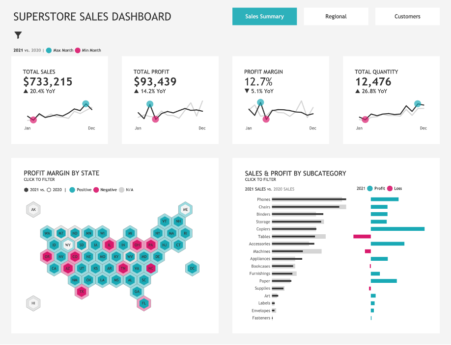
I then leveraged the “auto-generated phone layout” feature. Here is the result:

It’s not bad, but the map’s title is far away from the map, the filters are near the bottom of the dashboard, and there’s all that extra space near the bottom! Also, I had used containers in the default layout, and all the containers and their formatting have disappeared.
Using the “Auto-generated phone layout” feature:
When you create a dashboard in Tableau, you are working in “default” dashboard mode and a phone layout is always automatically generated. You may have never even noticed the phone layout if your organization hasn’t had access to Tableau Mobile.
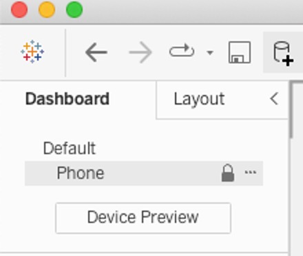
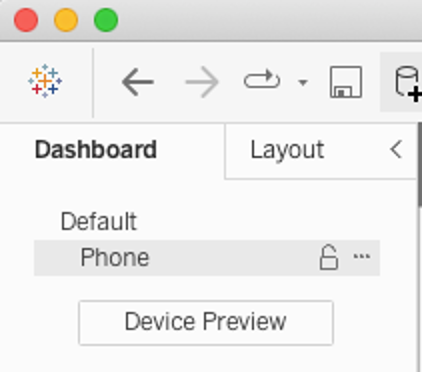
The auto-generated phone layout (indicated by a closed lock icon) automatically reflects changes to the default dashboard. Once you create a custom phone layout (indicated by an open lock icon), it becomes fully independent and you’ll need to manually add and arrange items to reflect changes to the default dashboard. For example, let’s say you have an image on the default layout with a link to a website. If you change the URL on the default layout, you will have to also change the URL on the phone layout. This will add extra steps to the process, so this is something to consider before creating a fully independent phone layout.
Custom phone layout – 4 Things to Keep In Mind
If you decide to create a custom phone layout, here are 4 things to keep in mind:
1. Phone-specific worksheets must exist in your default dashboard to be available for the phone layout, but you can add other objects like text, images, blanks, or navigation objects directly into the phone layout.
In my example dashboard, I have a view that looks at sales over time and by state for four regions.
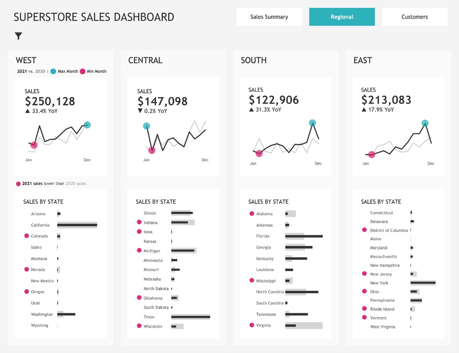
In my mobile-optimized version, instead of keeping all eight charts and scrolling through all of them, I’m going to have two charts (the scorecard and Sales by State) and use a filter to select a region.
I like to do this by adding a floating container to my dashboard in the default layout and then adding all the sheets I will need for my phone layout into the floating container. In this case, I’ll need the sales over time chart, the sales by state chart, and the region filter (since I don’t have that in the default dashboard). I then drag my floating container to the right side past the edge of my dashboard.
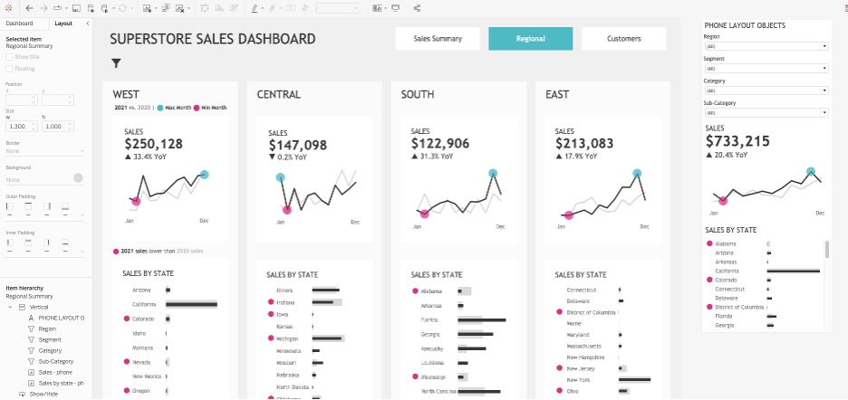
If the container is off to the side, it will not appear on your default layout when it is published, but the elements will be available in the phone layout section.
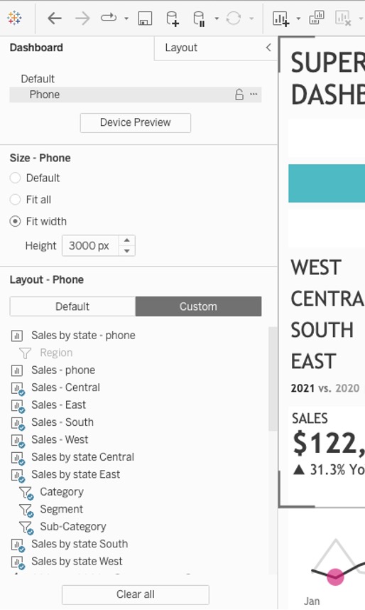
Now these items can be added to the phone layout. The blue check marks next to items indicate that those items are already present in the view you are currently working on. You can remove items from the phone layout, and they will still exist on the default dashboard. However, if you remove an item from the default layout, those items will not be available in the other layouts.
2. Consider how you will handle navigation between views.
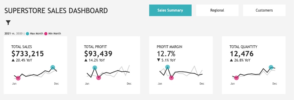
In the default layout, I elected to use navigation buttons instead of showing sheets as tabs for a more consistent look and feel in my dashboard.
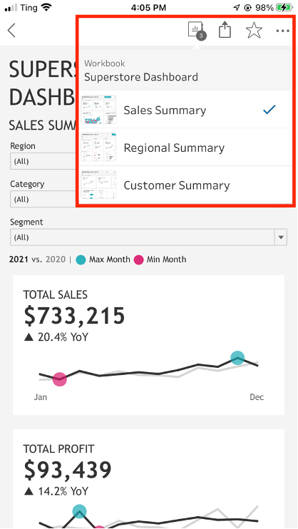
In the phone layout version, on the other hand, I opted to rely on the default navigation icon (the workbook icon in the toolbar). In my opinion, the thumbnails next to the view names provide a great user experience and the icon will be there whether or not you select “show sheets as tabs” when publishing your dashboard. There’s also a great default landing page with a preview of all the views.
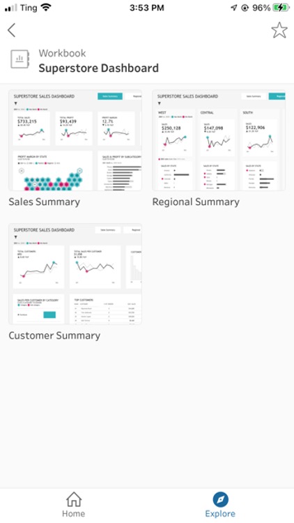
3. Use caution when editing objects that exist in both the default and phone layouts!
Certain objects that exist in both layouts can be formatted independently between layouts, but other objects retain the same formatting between layouts.
For example, the formatting of a legend is independent on each layout. On the left is a legend arranged in a single row in the default view and on the right is the exact same legend arranged in a single column in the phone layout.

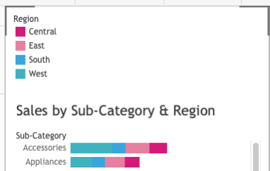
On the other hand, if you rotate labels on an axis in the phone layout, it will also rotate in the default view.
I always prefer a horizontal axis label, but when working with phone layouts you may notice that occasionally your horizontal labels are getting cut off. If you choose to rotate the labels, they will also rotate in your default view.
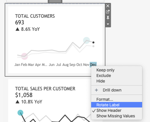
4. Use device preview to click through different device models to see how your layout will display on different devices. You may notice that you need to adjust some items, so they fit on the narrowest device and you avoid the dreaded ###.
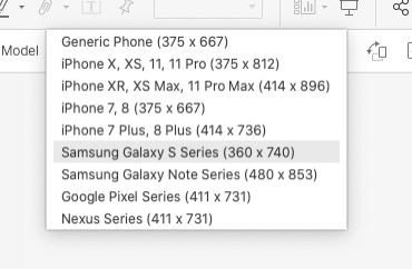
Bonus tip: You may need to add other layouts
If users in your organization will be using tablets to access dashboards, you may also need to add a tablet layout.
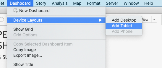
These tend to be more straightforward to add compared to the phone layout, but they will usually need some re-formatting.
Here is how the auto-generated tablet layout looked for my superstore dashboard.
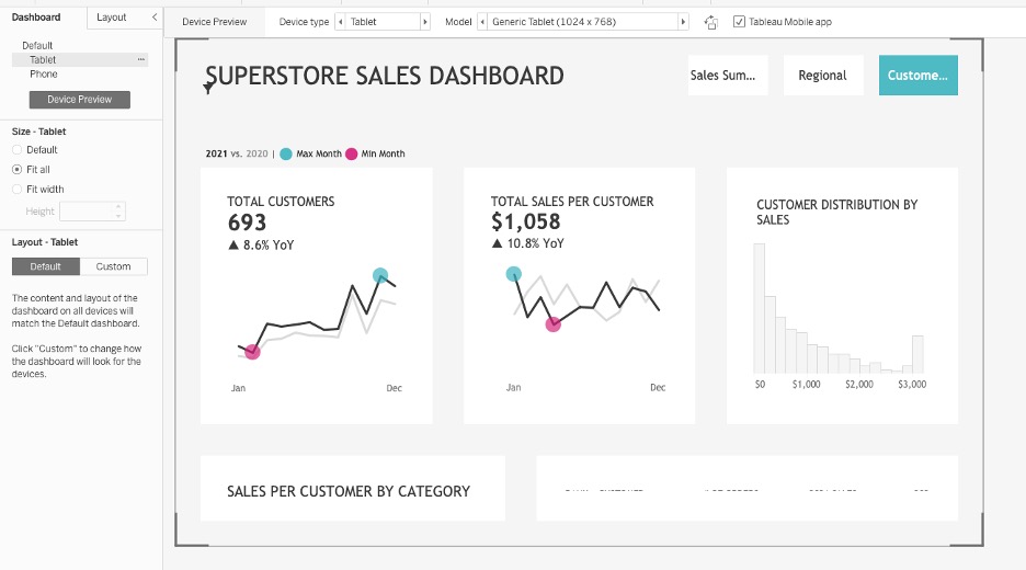
I needed to adjust the font size on a few things and adjust the height of the dashboard, but it was a much faster process compared to setting up the phone layout.
Here it is after some quick formatting:
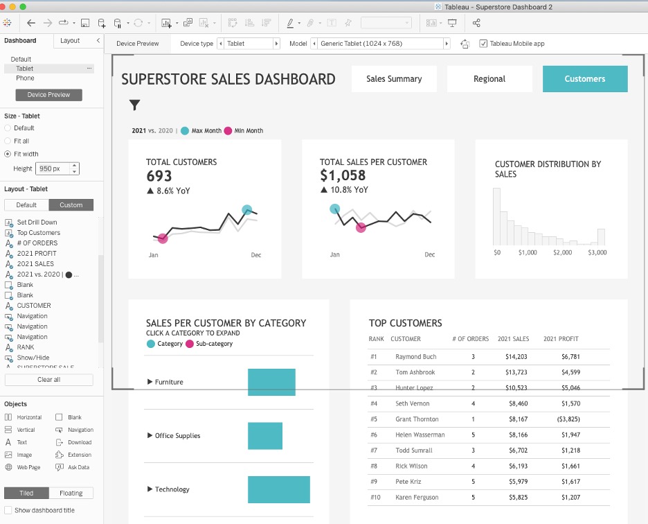
You can explore the full superstore dashboard I created on any device on Tableau Public. Please note that navigation between views works differently on Tableau Public than on Tableau Server or Tableau Online, so I added navigation buttons to the phone layout on the Tableau Public version.
To learn more about how Lovelytics can help clients create dashboard that will look and work great on any device, please visit us https://lovelytics.com or connect with us by email at [email protected].

