
The phrase coined by Henrick Ibsen “A picture is worth a thousand words”, is a great reminder of the power of data visualizations in telling a story with data. To effectively use data to tell a story we need to make sure our dashboards support, not hinder our storytelling.
This series will cover six (6) design tips that will help you create business dashboards in Tableau that are easier to comprehend and visually more appealing.
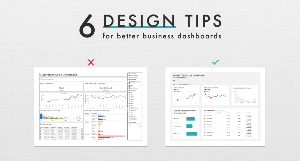
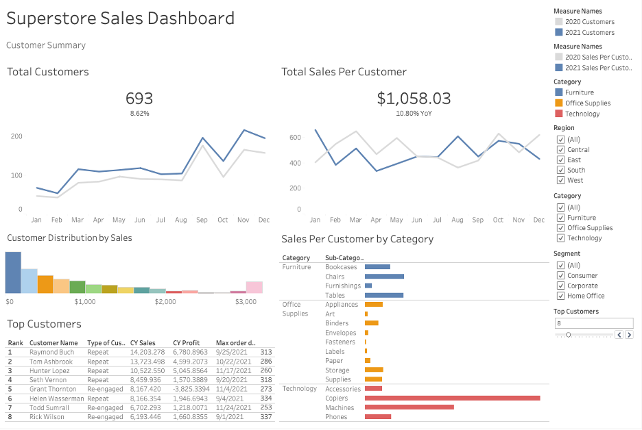
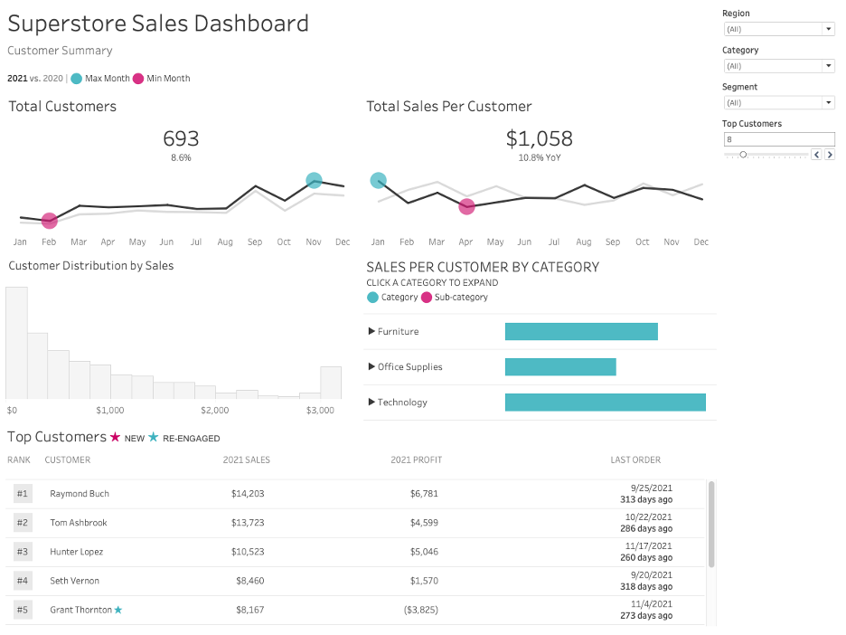
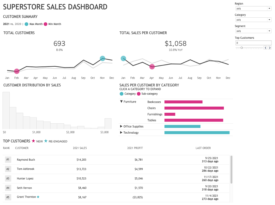
I’ll cover all the steps I went through to transform this Superstore Sales Dashboard:

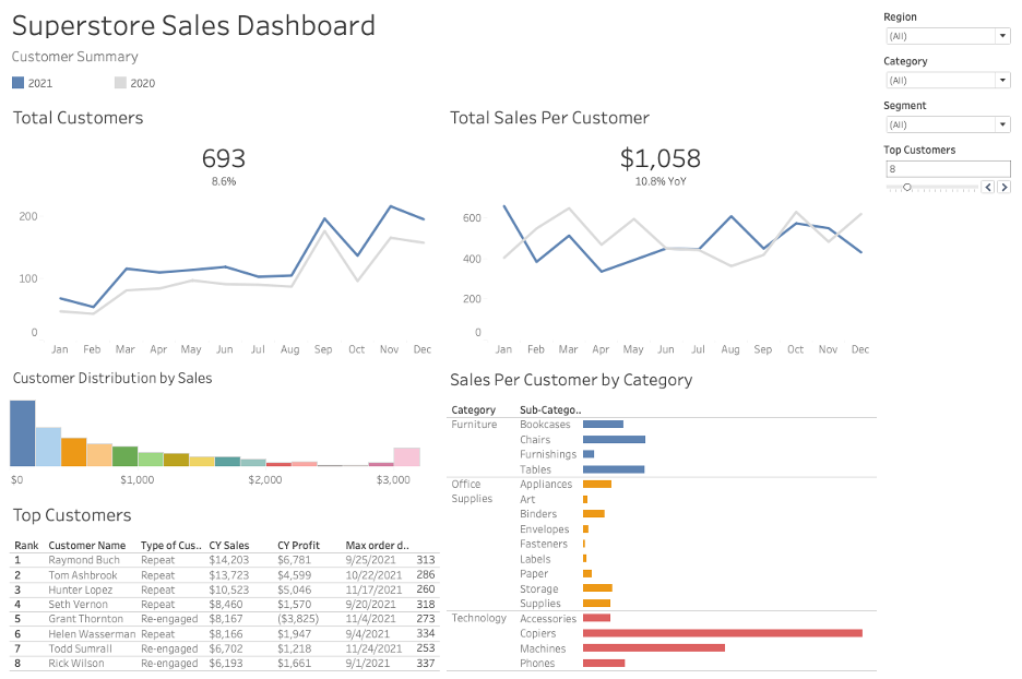
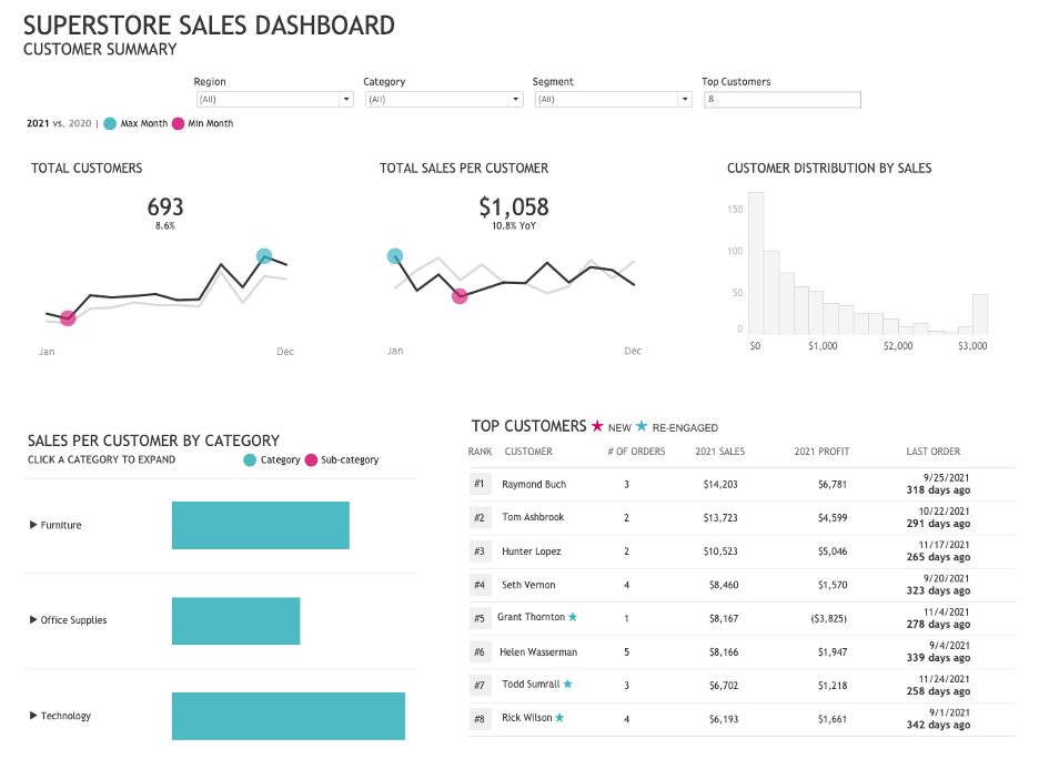
To This:
Tip #1: Declutter
Visual clutter confuses our audience with too much information.
Taking a few additional steps to clean up visual clutter can have an immense impact on reducing your audience’s cognitive load. A dashboard contains a lot of complex information, but our job is to make that information easier to consume. One way we can do this, is to reduce any unnecessary elements from the dashboard that increase cognitive load without providing anything useful.
- Remove Borders & Gridlines
Borders around charts are usually unnecessary. While they do provide a visual cue of where one chart ends and another begins, we can employ other strategies to accomplish this which we’ll talk about in part 5.
Gridlines are often unnecessary as well. There may be instances where you choose to keep gridlines, but when you do make them thin and a light gray (which conveniently is the default setting in Tableau!)
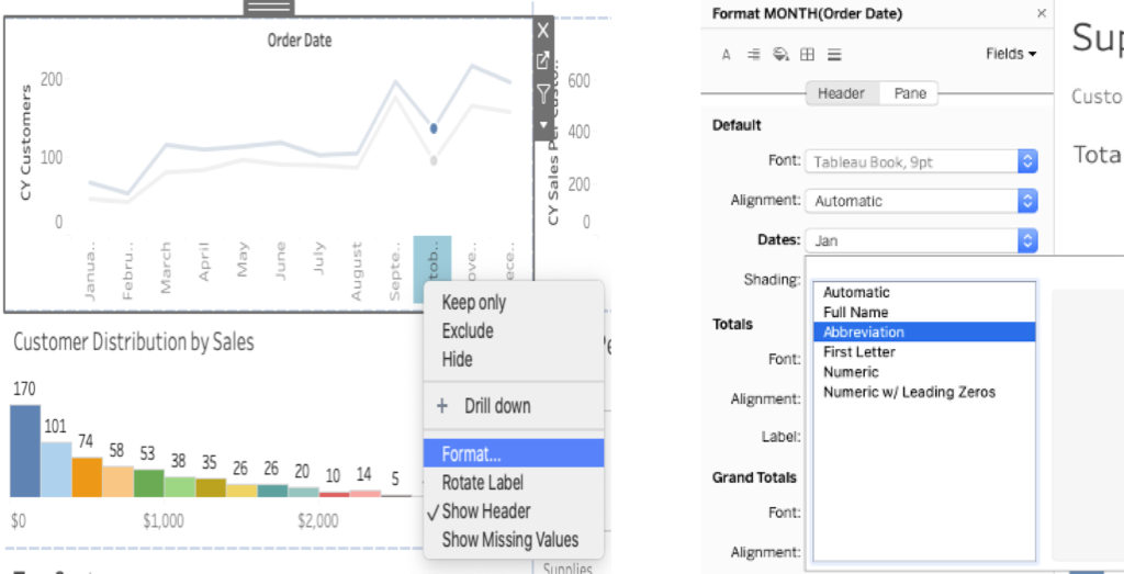
2. Format Axis Labels
Very few things annoy me as much as labels that don’t quite fit in the space provided, with the possible exception of vertical labels. This dashboard has both! We can solve both problems by using month abbreviations, which will fit nicely in the chart.
When your chart has a descriptive title, such as the titles of both line charts, you can get away with removing the y-axis labels.
Additionally, labeling every single data point, like in the two bar charts, is usually completely unnecessary, particularly with Tableau’s tooltip functionality.
3. Reduce The Number of Decimal Points
Consider the number of decimal points necessary and be consistent throughout the dashboard. In this dashboard, some numbers have zero decimal points, others have two, and in the table on the lower left there are numbers with three and four decimal points.
I will go ahead and select zero decimal points for the sales & profits figures and one decimal point for the year over year percent difference numbers.
This small change helps make the table much easier to read.
4. Consider Placement of Legends
When possible, it’s best to label data directly and then you don’t even need to include a legend.
In this dashboard, we can safely remove the category legend since each category is already labeled and the legend is superfluous.
In the line charts, we could label the lines directly but for now, we’ll keep the legends but move them closer to the charts so that our eyes don’t have to jump around the entire dashboard to find the legend. We can also simplify the labels to “2021” and “2020” since both charts are comparing those two years.
5. Clean Up Filters
Tableau defaults to showing filters as a list, but the dropdown menu option is much cleaner.
Tip #2 Create Better Tables
Now we’ll discuss how to transform a table into something that doesn’t just look nicer but is easier and quicker to read.
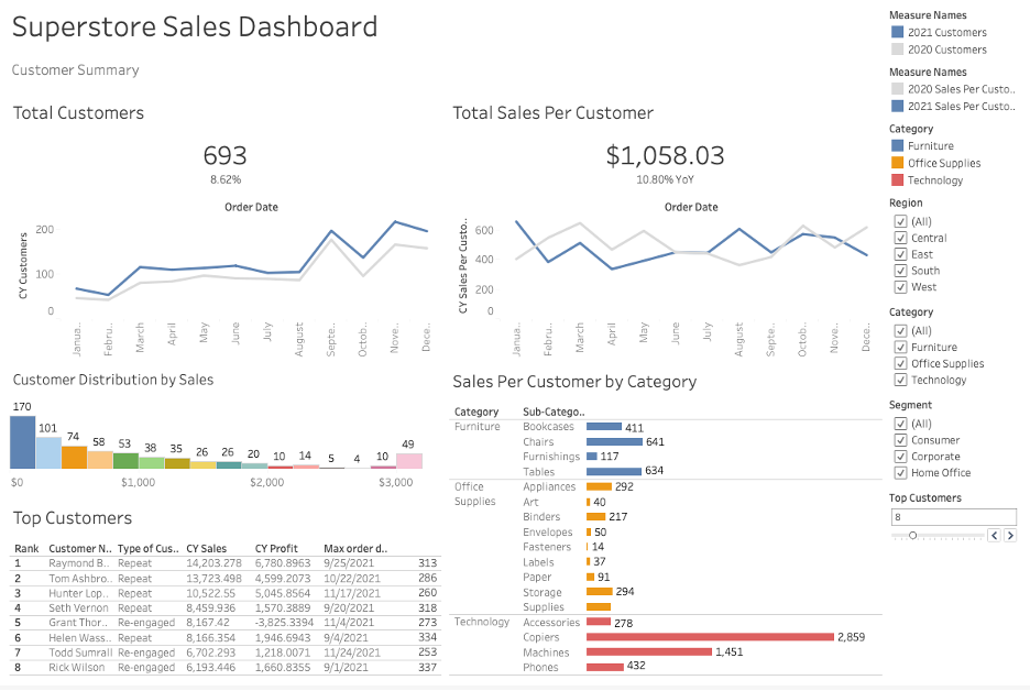
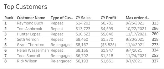
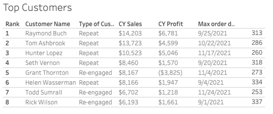
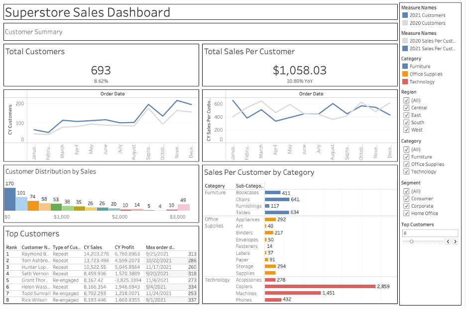
The table in the original dashboard looked like this:
In Tip #1, we removed unnecessary decimal places, row shading, and the border around the table. The following steps will help transform this table even more.
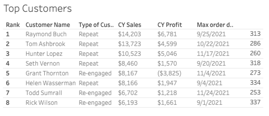
- Lighten Borders
Currently, the row borders are the same color as the text in the table. The borders are a nice visual cue of where one-row ends and another begins but they aren’t as important as the information in the table, so they need to be lighter in color.
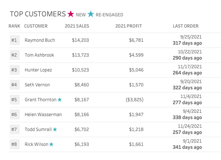
2. Leverage Visual Cues
We’ll replace the words in the Type of Customer column with stars to indicate which customers are new and which have been re-engaged this year. We won’t point out the repeat customers since that isn’t particularly interesting here.
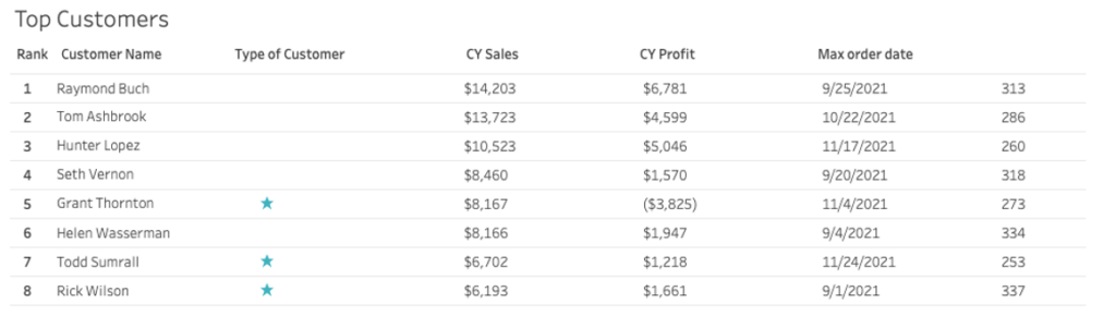
3. Combine Related Data
Now that our type of customer column is so sparsely populated, we can combine it with the Customer Name column. We can also combine the last two columns since they both have to do with the last order the customer made.
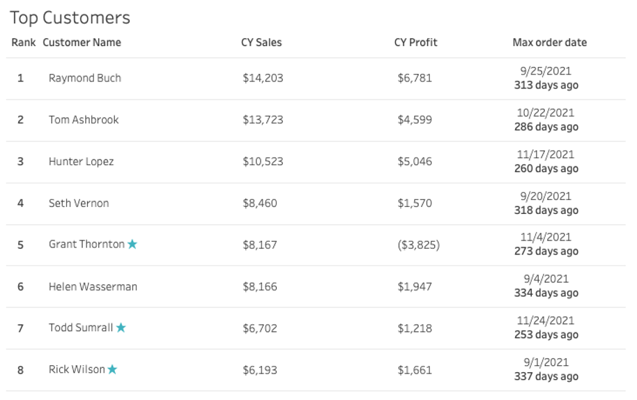
4. Right Align Numbers
Numerical values are much easier to compare and contrast when they are right-aligned. By right aligning all the numbers you can quickly see which numbers are smaller and which are larger.
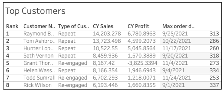
After cleaning up the headings & spicing up the rank numbers, we have a great-looking table!
Tip #3: Use Color Strategically
We will discuss how to use color sparingly and with intention in our dashboard.
Color is incredibly powerful and when it’s used strategically, it can help us highlight what we want our audience to notice.
When building business dashboards, we will let brand colors guide us but that doesn’t mean that we’ll use the entire color palette on a dashboard. Choose one or two colors to do most of the work and then use neutral colors such as black, gray, and white where needed.
For our example dashboard, we’ll use these two colors:
⬤ #2DB1BB
⬤ #DC2D79
Let’s go through each chart and explore how we can improve our use of color.
Line Charts:
Before:
We’ll use our two dominant colors to improve our line charts by highlighting the month with the highest value and the month with the lowest value. We’ll also change the blue line to black for better contrast with our highlight colors.
After:
Bar Charts:
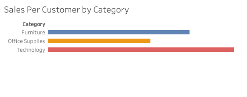
Before:
Not every chart requires color. In this chart, the height of the bars communicates the information we need to know, and the colors add no additional information.
We could choose to highlight one bar that we’d like to draw our audience’s attention to, but for our purposes, we will simply use a neutral color for these bars.
After:
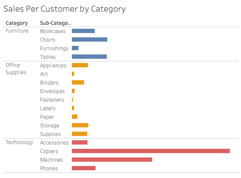
Using Sub-Categories
Before – Sub-category hidden
Before – Sub-category shown
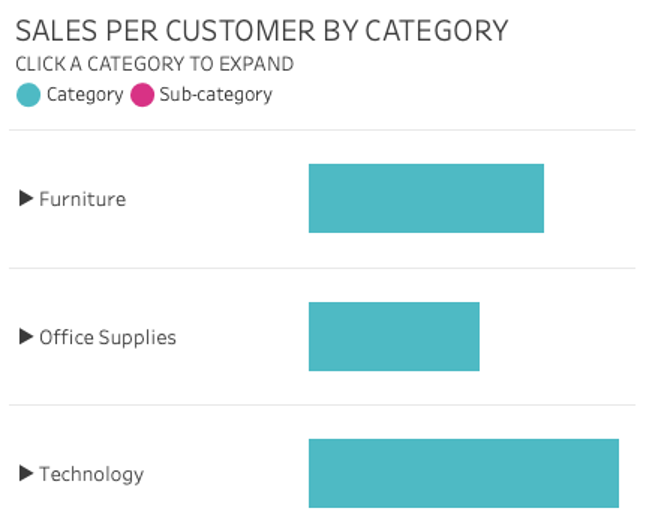
Before we discuss color in this chart, we’re first going to make it a little bit better using a set action drill-down method covered by Ann Jackson at the 2022 Tableau Conference.
With Ann’s set action drill-down method, we’ll improve the user experience of the drill-down action and we’ll be able to use color in a more meaningful way.
After – Sub-category hidden
After – Sub-category shown
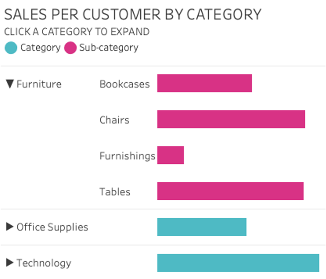
By improving the use of color in this dashboard, our audience can now more readily see what is important in our visuals.
Tip #4: Standardization of Fonts
Now, we’ll discuss fonts.
FONT SIZE
To keep our dashboard looking neat and consistent, we’ll want to make sure to use the same font size for each category of text and we won’t use more than four sizes in the whole dashboard.
Dashboard title – 24pt
Subtitles and Chart Titles – 12pt
Labels and Text – 9pt
Axis – 8pt
We’ll also want to make sure we’re consistent with where we user uppercase and sentence case.
USING FONTS FOR EMPHASIS AND CAPITALS
Most of the time, I only use the regular font on a business dashboard. Occasionally, I will use bold for a word or a phrase to emphasize its importance. I rarely use italic, but will sometimes use it for a note, data source, or author. In short, generally you rarely need to use bold or italic in a dashboard.
While we haven’t talked about alignment yet (that’s in Tip# 5), text can take away from the neatness of design because it doesn’t align neatly. Capital letters, on the other hand, align well and are great to use in dashboard and chart titles.
Web Safe Fonts
Changing the font on your dashboard from the default Tableau fonts can be tricky because once you publish your dashboard there is no guarantee that your font will display as expected on someone else’s device.
Ken Flerlage covers this in great detail on his blog and you can check out this Tableau knowledge base article as well to learn more.
In short, the only font that is guaranteed to display as you see it on your desktop is a font in the Tableau family of fonts. Otherwise, use a common font such as Arial or Courier New.
For our dashboard, we’re going to use Trebuchet MS which is on the list of Tableau standard fonts and is a web-safe font (which just means that it is included with most operating systems).
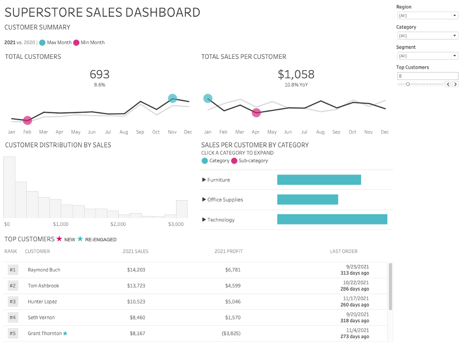
Here is our dashboard with consistent font sizing, capital letters, and with the Trebuchet MS font:

Tip #5 Alignment & White Space
The last part of the Design Better Business Dashboards series will cover two major topics in design: alignment & white space.
In this series we’ve covered several design tips that have transformed this original dashboard from this:
To This:
The dashboard is looking much better than it did initially, but it still needs a few tweaks to look even better.
When we removed the borders around each section in the first part of the series to reduce visual clutter, we took away the visual cue telling us where one section ends and where the next one starts. This dashboard needs visual cues to help guide our audience from one section to the next.
Instead of adding the borders back in, we’ll leverage white space to separate the charts from one another, improving our audience’s comprehension of our dashboard.
We also need to adjust the layout to address several issues:
- The line charts are quite flat so we will fix their aspect ratio
- The information in the Top Customers table doesn’t fit so it requires scrolling
- The Sales Per Customer by Category chart needs some more vertical space
- The filters need to be moved for a better user experience
Tip #6: Text Alignment
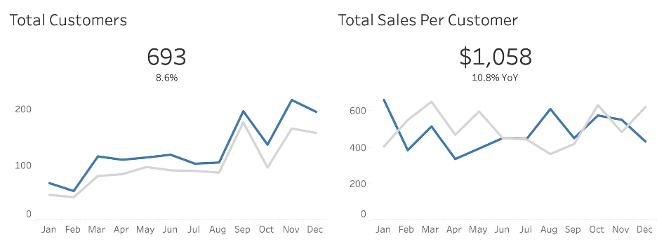
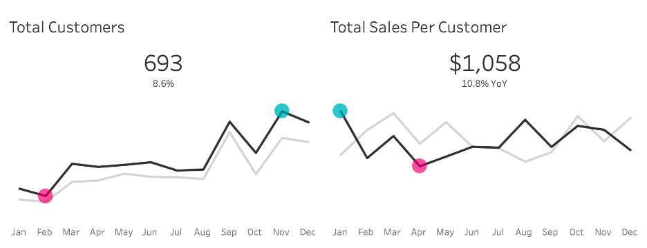
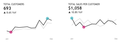
When we improved the Top Customers table in Tip #2, we made sure to right-align the numerical values so that they were easier to read. When it comes to text, in most cases, we’ll want to left-align all text to give our dashboard a more professional, clean, and well-organized feel. Look at the Total Customers and Total Sales per Customer KPI’s in the picture above.
Now, take a look below to see how much better those numbers look once they’ve been aligned to the left.
When I fixed the alignment of these KPI’, I also took the opportunity to use a tip I learned from Andy Kriebel to place the chart title & KPI in the same worksheet as the line chart! Fewer worksheets mean less maintenance down the road.
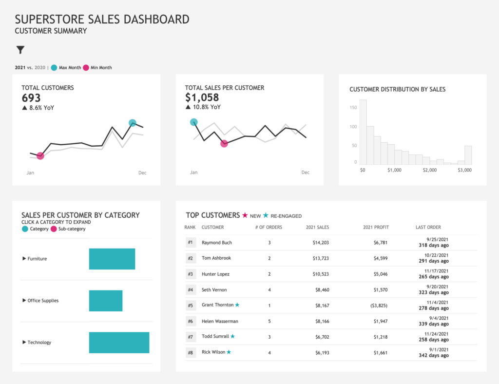
Alignment is important not just in text, but in all elements of the dashboard. Currently, the filters are centered and not aligned. The two charts on the bottom are also not aligned with the three charts across the top. Once we’ve fixed the alignment on these elements, our dashboard looks much neater and more organized.
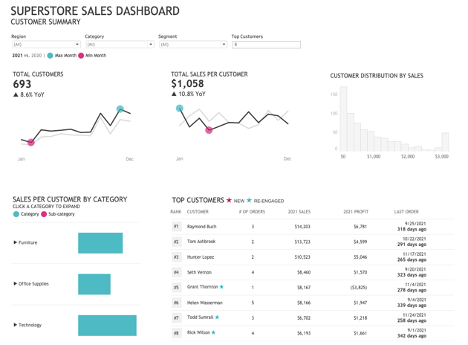
Increasing the amount of space between elements placed more emphasis on the elements within the dashboard, but I think it could use a little bit more design to make it even better.
Adding a light gray background to the entire dashboard and a white background for the charts, makes the charts seem like they are popping off the screen. Additionally, hiding the filters with a show/hide button creates a much cleaner dashboard overall.
Here is the result:

To see the complete dashboard please visit Tableau Public. Tableau is a powerful platform that lets you explore and see your data in so many ways. We work with clients every day, helping them do more with their data. How can we help you? Please visit us at www.lovelytics.com or connect with us by email at [email protected].