How to compare a Static Dimensional Value to a Dynamic Value of the same Dimension-Part 2
Welcome to Part 2 of the series comparing one “static” dimensional value against another “dynamic” value of the same dimension. In this section, we are going to focus on making your visualization easy to consume, or in other words, “Making It Cute”.
In Part 1 of this series, we covered the basic “how to” of achieving the desired outcome using a parameter.
You can download the workbook here.
In this section, we’ll start with Step 6 where we left off, and walk-through formatting tips and tricks to achieve the final result.
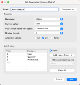
Step 6: Make the measure dynamic
Create parameter: Choose Metric
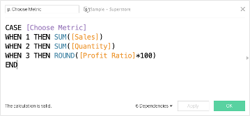
Step 7: Connect the parameter to the data set with a calculated field, p. Choose Metric
Step 8: Replace Sales on Columns with p. Choose Metric.
Step 9: Apply some additional formatting for improved design
(This design tip comes from the Flerlage Twins’ Make It Better session at TC2021)
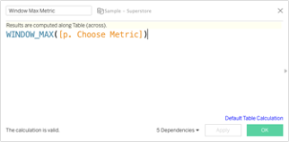
Create a calculated field: Window Max Metric
Bring Window Max Metrix ahead of Sales on Columns, then right-click and choose dual axis. Synchronize the axes and then hide both.
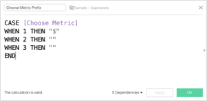
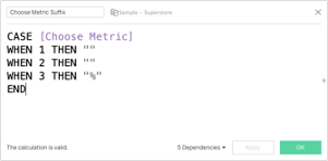
On the Window Max Metric Marks Card, add p. Choose Metric to Label and format as a number with no decimals. In this example I also created two additional calculated fields that I’m using on label to control adding a $ for when the selected measure is Sales and a % for when the selected measure is Profit Ratio.
Click the Size shelf and use the slider to make it as small as possible. Change
Color to dark gray or black and also add a white border.
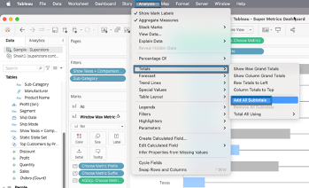
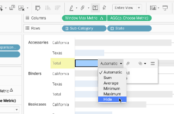
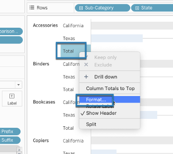
From the Analysis tab, turn on Subtotals. Click on the actual subtotal marks for both Window Max Metric and p. Choose Metric and in the command button that appears on the tooltip switch from Automatic to Hide. Format the Total header by right-clicking the word Total in the view and deleting the “Total” label.
Step 10: Right-click anywhere in the view to open the Formatting pane and then remove Row and Column borders and all grid lines
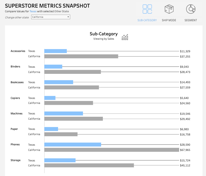
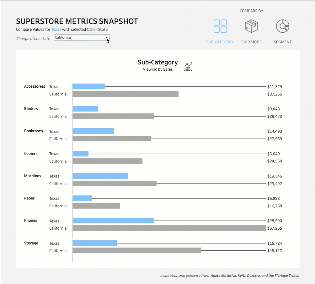
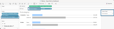
If you have more than one dimension you want to break the view down by, continue with the following steps. In this scenario, I want to compare my static state and dynamically selected state by Sub-Category, Ship Mode, and Segment.
Step 11: Swapping out for multiple dimensions
First you will need to duplicate your existing worksheet and then swap out the second dimension you’re interested in comparing by on Rows, then repeat for however many additional dimensions you have.
In this scenario, I duplicated my Sub-Category view twice. On one of those views, I replaced Sub-Category with Segment and replaced Sub-Category with Ship Mode on the other. I also renamed the sheets to match the dimension they show.
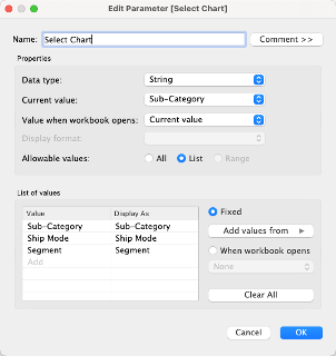
Step 12: Create a parameter that will control which chart is showing in the dashboard
(This tip comes from Keith Dykstra’s blog on how to use parameter actions and icons for sheet swapping).
Name: Select Chart
Step 13: Create a calculated field that we will use as a filter to show or hide the selected chart.
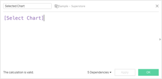
Step 14: Add the Selected Chart calculated field
Add the selected calculated field to each sheet and filter so that it matches the name/dimension used on that sheet. You will need to show the parameter control for the Select Chart parameter on each sheet in order to toggle it to match the correct dimension. Once you’ve finished adding your filters to each sheet, you can hide the parameter control.
Step 15: Create a new dashboard.
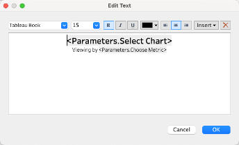
Add a vertical container and bring each sheet into the container, along with a single text object that will serve as the sheet title. Insert the Select Chart parameter and the Choose Metric parameter into this text object.
Hide the original sheet titles for each sheet.
Step 16: In this final section, we will create five additional worksheets that will all serve to create the effect of selecting an icon to swap which of our dimension charts appears
- Add New Worksheet #1 and rename “Text Control Sheet”.
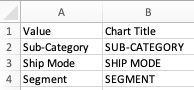
- Open a new Excel workbook and add two columns, one called “Value” and the other “Chart Title”. The “Value” column should match your Select Chart parameter exactly. The “Chart Title” column can also match exactly or you can change to all upper case as I did in this example.
- Connect to the new Excel workbook as a new data source in Tableau. Bring Value to Columns and Chart Title to Text.
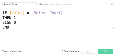
- To make the color of the text dynamic based on selection, create a calculated field called Selected Color then bring that field to Color on the Mark Card.
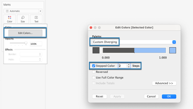
- Edit the Colors so that the palette uses a Custom Diverging one where the left-hand color is a neutral (like dark gray/black) and the right-hand color is the same as the color you chose to represent the static dimension (I used light blue to represent Texas). Use a 2-step color.
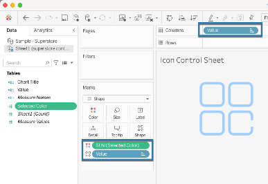
- Repeat these steps for New Worksheet #2 renamed “Icon Control Sheet”. The only difference is that instead of having Chart Title on Text, you’ll bring Value to Text on the Marks Card and set the Mark type to Shape. The shapes should be custom and can be added to the Shape file within your My Tableau Repository folder. I found my shapes at flaticon.com.
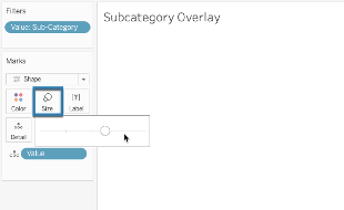
- Add New Worksheet #3 and rename “Sub-Category Overlay”. On this sheet, set the Mark type to Shape and bring Value to Detail. Also bring Value to the Filters shelf and select only Sub-Category.
- Make the Size of the shape as far to the right as the slider will allow.
- Change the Tooltip to read: “Click to see metrics by Sub-Category”
- Repeat this step two more times so that you have New Worksheets #4 and #5 renamed “Ship Mode Overlay” and “Segment Overlay”, respectively, and that the filter on those sheets and tooltip matches the associated dimension name.
- Come back to the dashboard you created in Step 14 and add the Text Control Sheet, the Icon Control Sheet, and the Overlay Sheets to it. The Overlay sheets should be floated on top of the Icon Control Sheet.
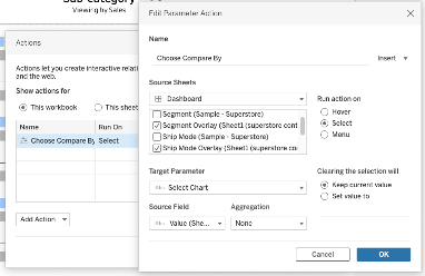
- Click the Dashboard tab > Actions > Add Action > Parameter Action
- The source sheets should be all three Overlay sheets and nothing else
- The Target Parameter is Select Chart
- The Source Field is Value from the Excel control sheet data set
- Run the Action on Select
That’s it! You’ll want to be sure that your Comparison State and Choose Metric parameter controls are exposed somewhere on your dashboard. On mine I placed my Comparison State control at the top near the sub-title and included my Choose Metric control within a hidden container near the text object I used in lieu of a sheet title.
Credit due to my friend and Tableau rock star Agata Ketterick for helping me come up with this solution.
We work with clients every day, helping them do more with their data. How can we help you? Please visit us at www.lovelytics.com or connect with us by email at [email protected].