por Agata Ketterick | Ago 29, 2022 | Visualización de datos, Tableau
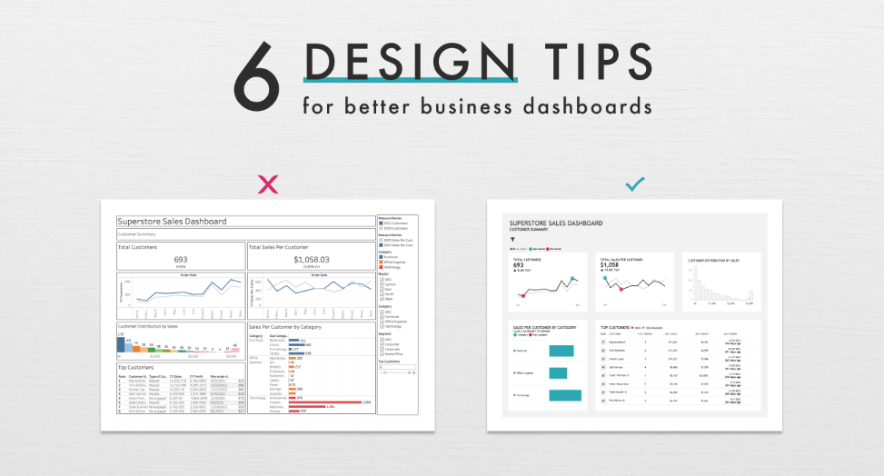
The phrase coined by Henrick Ibsen “A picture is worth a thousand words”, is a great reminder of the power of data visualizations in telling a story with data. To effectively use data to tell a story we need to make sure our dashboards support, not hinder our...
por adminlovelytics | Abr 28, 2022 | Data Analytics, Data Strategy, Visualización de datos, Tableau, UX
Lovelytics, a Gold Sponsor at this year’s Tableau Conference 2022 , is being well represented by our best and finest data visualization consultants. With a Tableau Visionary (formerly Zen Master), Tableau Ambassadors and frequent contributors to enable and...
por Oliver Inca | Mar 25, 2022 | Data Analytics, Visualización de datos, Tableau
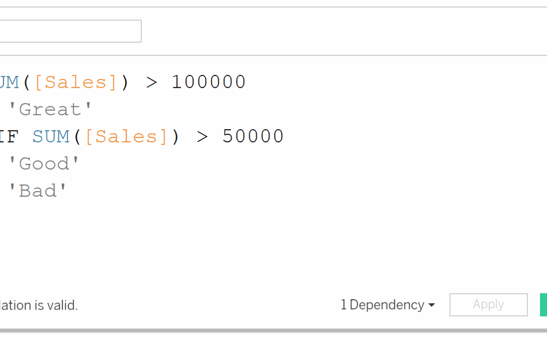
When working in Tableau, I find there are instances where we might want to color a text table based on a dimensional field, or maybe more specifically, a type of KPI. For example, lets say we have the table view below of Sales by Sub-category and Segment, and we want...
por Pat Sarsfield | Oct 7, 2021 | Tableau
The tag option available on Tableau Server and Tableau Online is one of my favorite and, in my experience, one of the most underutilized features. So, what gives!? Many people may be familiar with tags from social media (Twitter, Instagram, LinkedIn, Facebook, etc.)...

por Jake Kohler | Oct 7, 2021 | Design & Dev, Tableau, UX
It’s no secret that the world’s energy supply needs to transition from carbon-emitting, nonrenewable sources like petroleum, natural gas, and coal to renewable, carbon-free sources like solar, wind, and geothermal. It is natural to wonder how much renewable energy is...
por JD Franco | Dic 18, 2020 | Tableau
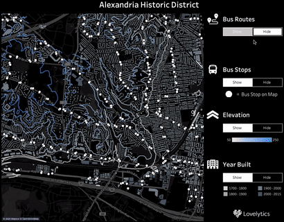
Tableau Map Layers Now Available Tableau released 2020.4, delivering expanded enterprise data capabilities, including unlimited geospatial map layers. These dynamic Tableau map layers open the door for enterprises to do more in-depth, advanced location-based data...