Synopsis: This article is a 101 level introduction to Databricks SQL, and will walk you through the steps to build simple visualizations directly within a Lakehouse environment. The article is focused around the UI and workflow of DBSQL and assumes the reader has basic SQL knowledge.
Databricks SQL (DBSQL) forms one of the three main components of the Databricks platform. It was released for General Availability ( GA) in December of 2021 following the world-record-setting TPC-DS benchmark for data warehouse performance. Here is a link to the announcement of that release.
DBSQL offers a serverless data warehouse and environment and SQL/BI workspace within a lakehouse implementation. This enables SQL-proficient analysts and BI users to jump into the platform and start building dashboards without a steep learning curve. It supports built-in governance across all data-teams, excellent price/performance, and a rich partner ecosystem to build off of with integrations into Tableau, Qlik, PowerBI, etc.
For the purposes of this article, however, I will be focusing mainly on the dashboarding and visualization tools built into DBSQL. This came out of Databricks acquisition of Redash, an open source visualization tool, announced in June of 2020. For what it lacks in robust visualization capabilities, it makes up for in ease-of-use and agility. DBSQL is the perfect tool to create quick visualizations and internal dashboards for ad-hoc or simple reporting purposes. (e.g. monitoring the health of ETL pipelines built in Databricks).
For this article, I’m going to walk you through the process of querying an existing Delta table in the DBSQL Query Editor, creating a visualization from the resultant query, and adding it to a Dashboard. I’ll also discuss some of the options that exist for putting a DBSQL dashboard into production.
Alright, let’s get started!
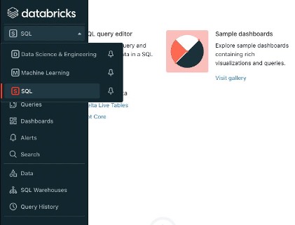
SQL Workspace
The first thing you’ll want to do is navigate to the SQL workspace. This can be done by clicking on the dropdown within the side panel and selecting “SQL”
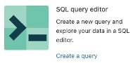
Once you’re in the SQL workspace, there are a handful of ways to launch the query editor. The simplest is to click on “Create a query.” (If you don’t see this option, you can click on the “+” to the left and then query.
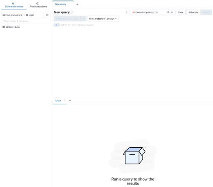
Now that we’re in the query editor, there are a couple of things to take note of. On the left you’ll see a list of tables in the database you currently have loaded, this is called the “Schema Browser” – if you click on one of the tables, it will expand and show the schema for that table, as well as allow you to easily insert column names into your SQL query. You can also tab between the schema browser and past executions, which will show you previous executions of your query.
We also see a tab that says “New Query” at the top – this represents the query that we created, and allows for easy tabbing between various queries.
The dropdown that says “Demo Endpoint” represents the SQL endpoint we are currently connected to. A SQL endpoint can be thought of similarly to a cluster, it’s the underlying compute resource we are running our queries off of.
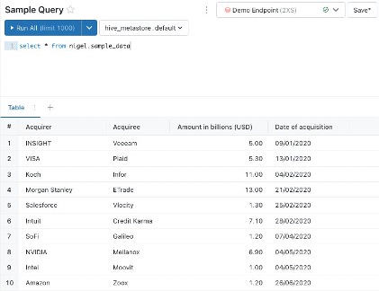
Sample Query
Here I’ve written a simple query that selects all of the data within our sample dataset. The editor will return a basic table visualization of our data, displaying the first 1,000 rows. The table is nice, but it doesn’t summarize our data very well and won’t add much value in a dashboard. This is where we want to build a visualization.
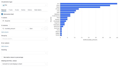
Build Visualization
To build our first visualization, click on the “+” to the right of “Table” and then select “Visualization.” This will open the visualization editor, that allows us to build visualizations from the result of our query. You can select the visualization type to choose from a wide array of charts and graphs. From this window you can also adjust things such as which columns populate your X and Y axises, grouping, stacking, naming, colors, and data labels to name a few. The best way to learn is to play around with the settings and see how they work! Once you’re satisfied with your visualization you can click “Save” in the bottom right corner.
Creating Dashboards
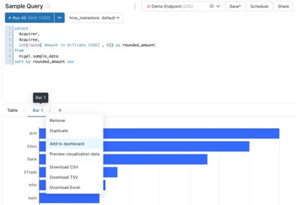
After saving your visualization, you’ll now see two tabs below the query itself, one for the table that displays query results and another for the visualization we just created. The next step is to add our visualization to a dashboard! To do this, click on the stacked three dots on the tab for the visualization we’d like to add and click “Add to dashboard.” This is going to create a popup that allows us to search for a dashboard or create a new one. For this example I will create a new dashboard. Click on “save and add” to add your visualization to the dashboard.
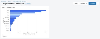
For the next step, please navigate to the newly created dashboard using the link in the popup notification
A dashboard is a collection of visualizations powered by underlying queries from our SQL query editor. The dashboard can be refreshed manually to re-run all of the queries and display the latest data.
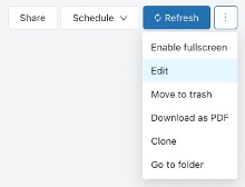
If we click on the dropdown to the right of the refresh button, a number of options appear. Clicking on “Edit” will open a grid display that allows us to move and resize visualizations on the dashboard. We can also clone the dashboard, or delete it.
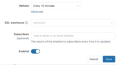
Having a static dashboard is nice, but it’s not ideal for an environment where you may have multiple users viewing a dashboard concurrently, especially if you want to maintain control over when the endpoint is active and the data is being refreshed. This is where the “Schedule” menu comes in handy. By scheduling refreshes, it allows an administrator or developer to ensure that the dashboard updates on a regular cadence. This means your stakeholders can have view access and know they are seeing the most relevant data, as well as syncing your refresh times with underlying data refresh/updates to avoid on unnecessary compute costs. You can also email a report to subscribers every time the dashboard is refreshed!
At this point you should have a basic understanding of the workflow from querying a delta table, to building a visualization, adding the visualization to a dashboard, and setting up the dashboard to refresh on a regular cadence as well as include your stakeholders in an automated distribution.
As a premier Databricks partner, we work with clients every day, helping them do more with their data. How can we help you? Please visit us at www.lovelytics.com or connect with us by email at [email protected].