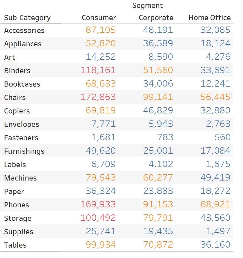
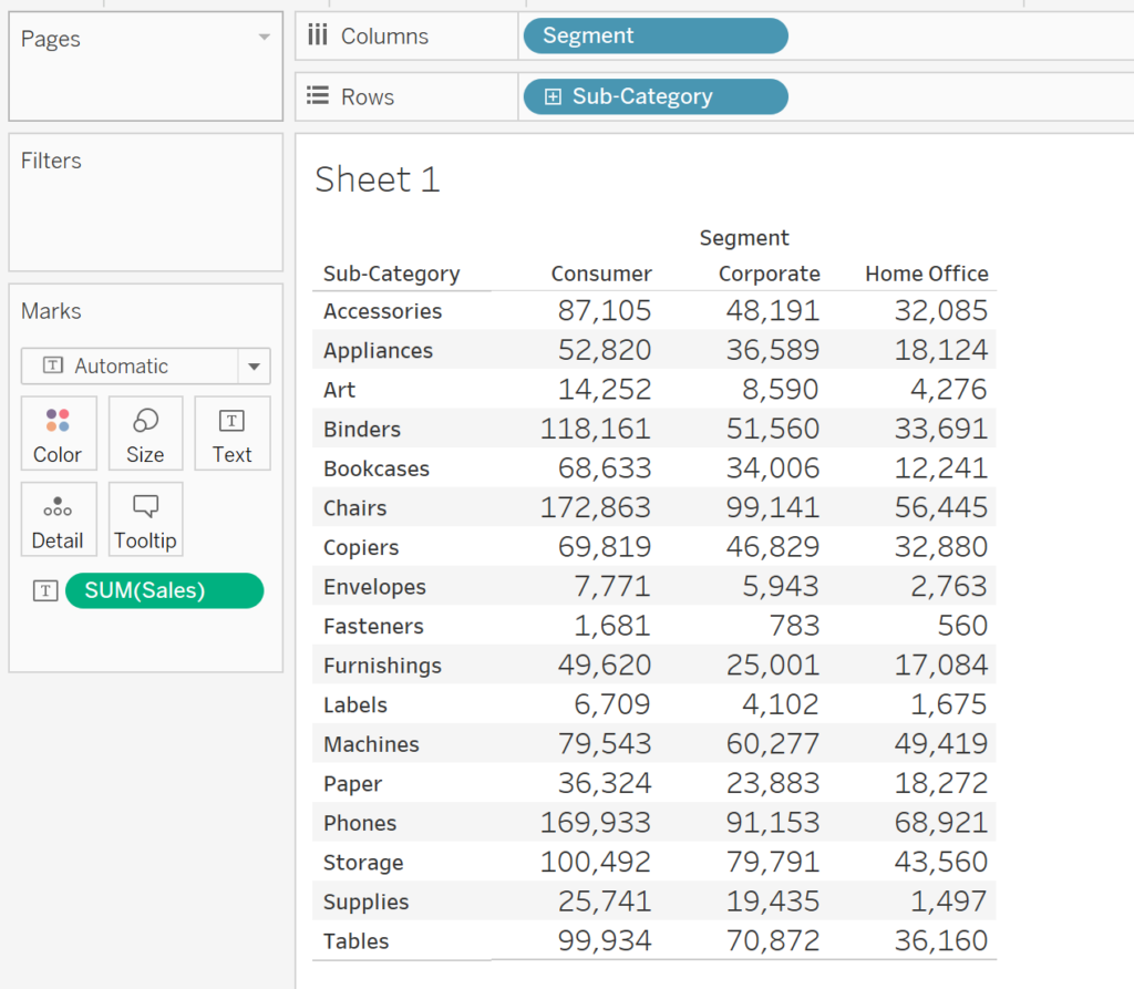
When working in Tableau, I find there are instances where we might want to color a text table based on a dimensional field, or maybe more specifically, a type of KPI. For example, lets say we have the table view below of Sales by Sub-category and Segment, and we want to color the numbers based on whether they are above, below, or in between certain thresholds.

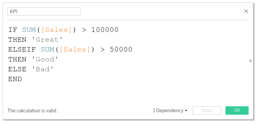
We can create a calculation like the one below and simply put that on colors to achieve our result.
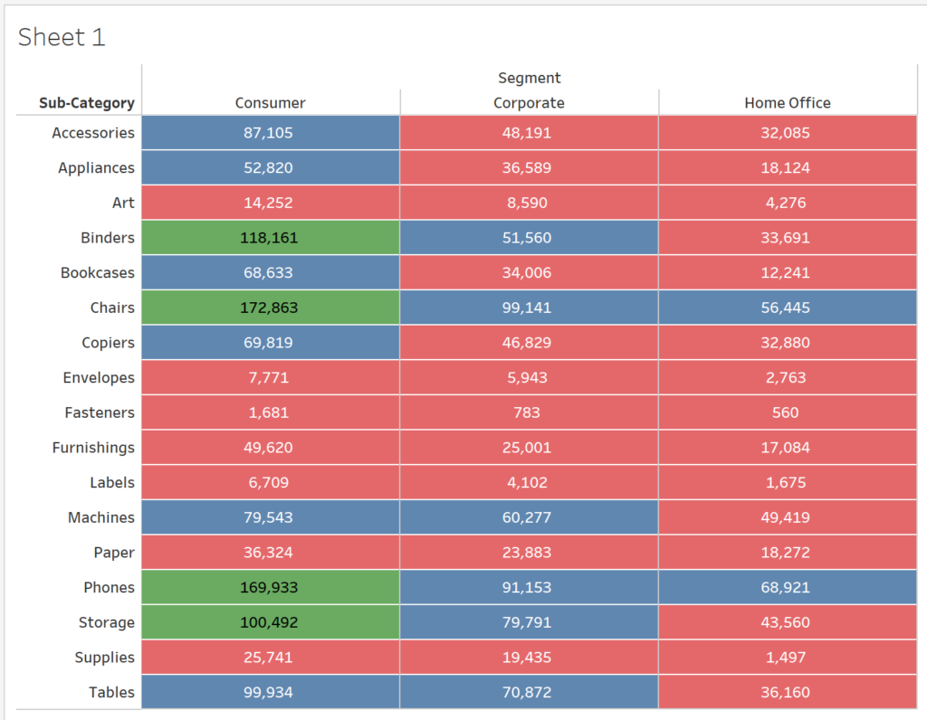
This may suffice for some of us, but what if I wanted to color the entire box rather than just the numbers? One might think to change the mark type from ‘Text’ to ‘Square’ and increase the size of the mark. However, you’ll soon realize that Tableau doesn’t give us what we expect. This post helps walk you through a couple of different ways to achieve the desired result below.
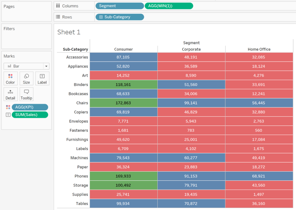
Option 1: Use a bar chart
Unfortunately, it isn’t enough to change the mark type to square because when using squares (or any other type of shape), those mark types aren’t self contained within their own cells. This is why when you increase the size of the square, the square traverses multiple cells and gives us some weird results. Given that information, using something like a bar chart works perfectly because bars within a chart are self contained to the specific combination of rows and columns.
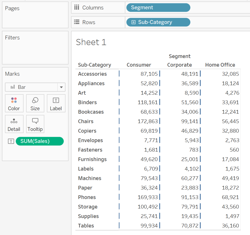
Let’s go ahead and set up the view first:
Next, in the Marks Card drop down menu, change the mark type to ‘Bar’. You’ll actually notice when you make that change, small bars appear next to every value. If you are asking yourself, “why isn’t Tableau creating a bar for the size of the Sales value?”, keep in mind that SUM(Sales) is currently on ‘Text’. The ‘Bar’ mark is looking for a measure on Columns or Rows to calculate the size, and since there is no measure on Columns or Rows, the bar shows up as not really having a size, or rather, having a starting and ending position of zero.
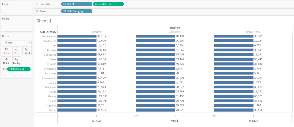
Next, we’ll have to create an in-line calculation (or a regular calculation) of MIN(1) and add that to the columns shelf. Since we are putting this on the columns shelf, now Tableau is trying to size the bar to reach a value of 1 for each cell.
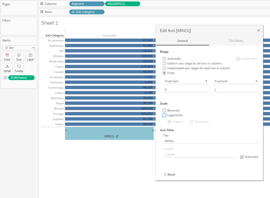
Now, with some formatting, we can right click the MIN(1) axis and make it a fixed range from 0 to 1.
From here, we can hide the MIN(1) header, increase the size of the bar, have the label align towards the middle, and make any other adjustments needed to get the right look and feel. At the very end, you’ll go ahead an place your dimension/KPI field on colors and BOOM, we have a text table with the cells colored in.
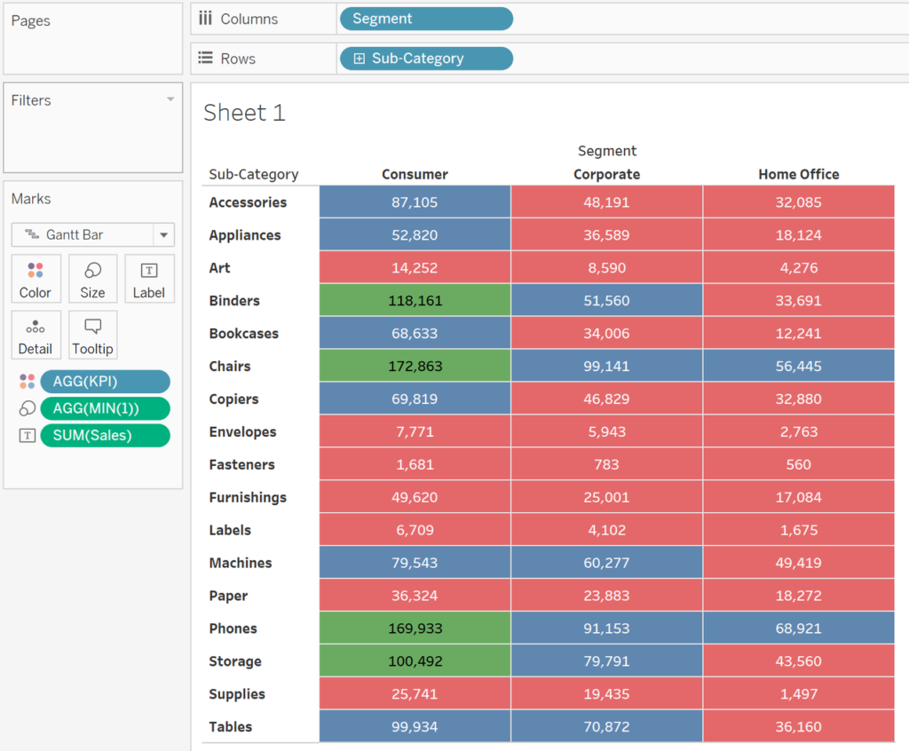
Option 2: Use a Gant Chart
This option follows the exact same steps as the previous option, with two exceptions. First, instead of choosing ‘Bar’ as the mark type from the Marks Card, you’ll choose ‘Gant Bar’. Second, you’ll have to move the dummy calculation of MIN(1) from the columns shelf to the ‘Size’ area on the Marks Card. In my honest opinion, this option is my favorite because it looks sleeker and formatting the borders of each cell is much easier.
Option 3: Using Dummy Dimension Fields
The final option is probably the easiest to implement. Let’s go back to our original view of Sales by Segment and Sub-Category. If we add our KPI to the color shelf, and change the mark to ‘Square’, we get a view like:
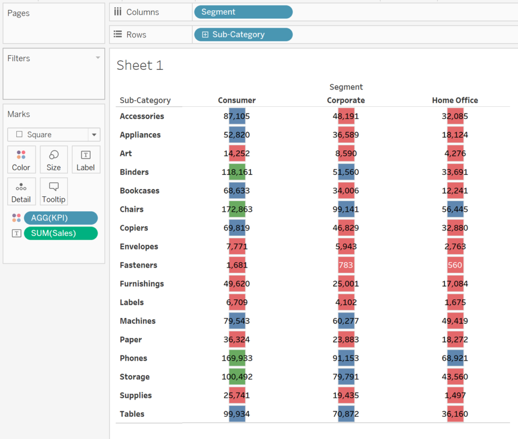
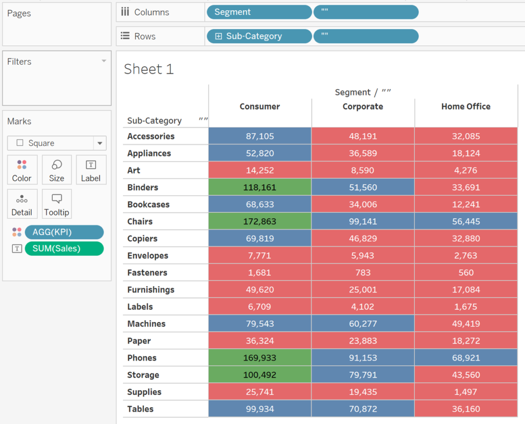
As we already discussed previously, if we try to increase the size of the shape, we start to see the squares overlap each other. A quick way to avoid the squares from overlapping each other is to double click on both the Columns and Rows shelf and type in two pairs of double or single quotes (these will serve as dummy dimension calculations). In doing so, Tableau will enclose the square to fit the unique combination of dimensions on Rows and Columns.
As you can see there are several options available to you to color measures by a dimensional field. Feel free to choose the one that works best for you. Tableau is a powerful platform that lets you explore and see your data in so many ways. We work with clients every day, helping them do more with their data. How can we help you? Drop us a line at [email protected].